Black Mountain School of Theology & Community needed a brand identity as the founders began laying its foundation. Dayspring ensured that their brand would signal the spirit, location, and intention of the school through layers of meaning integrated into a beautiful logo.
New brand design
The Partnership
Having little knowledge of design, the founders of Black Mountain School placed great trust in Dayspring’s design talent from the beginning. What they did bring as established academics and deeply compassionate theologians, however, were profound and subtle viewpoints, sometimes playfully divergent from one another, and a willingness to learn and engage through lively discussion at every meeting. If work can be enjoyable even as we’re pushed to reach higher and dig deeper, this partnership is proof.
The Challenge
The founders of Black Mountain School had recently established the organization by relying primarily on established connections. They needed a brand identity now that they were ready to begin announcing themselves to the public and sparking dialogue with the communities with whom they wanted to work.
It was clear from the first conversation that the brand design project would be a challenge of balance between opposing forces: between the desire to acknowledge the legacy of Black Mountain College–an influential art school during the middle of the 20th century famous for its maverick approach to education–and the need to distinguish itself and avoid confusion between two similarly named institutions; between the inward motion of community members converging to learn together and the outward thrust of the radiating impact that a place of learning can have on a community; and between the aesthetics of academia in its ivory towers and a vernacular visual language that’s more accessible to every person on the ground.
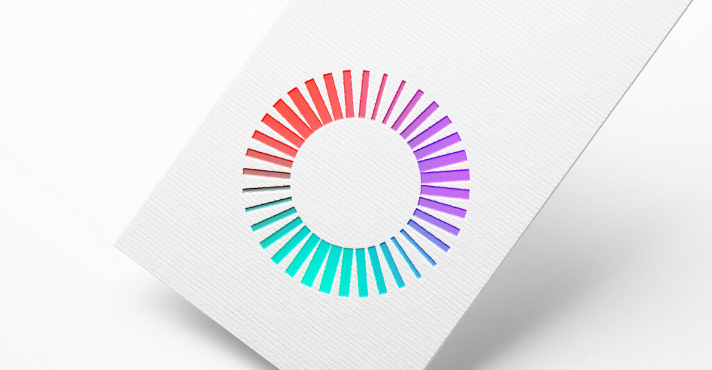
While we explored a broad set of directions, we ultimately settled on one that best balanced these forces. We followed the lead of Black Mountain College by using as our primary logomark form a single circle–the traditional university seal made modern by stripping away institutional symbology. Instead of a stark, solid band, we used converging lines to form the circle which does triple duty in conveying a sense of coming together, of extending outward, and of illumination. Rather than keeping the lines uniform, we varied their weights to create the effect of three pulses gesturing toward the Trinity. The notion of three is further amplified by the use of three colors that were selected for the bold yet inviting palette they create.
The result is a logo that is simple, bold, and inviting at first glance, but richly layered with meaning and pulsing with life when one lingers a little longer.
“Thanks for all of your great work! We really loved the process.”