The Partnership
Ekouté is a small consultancy that’s having a big impact on the nonprofit sector. Ekouté’s unique, thoughtful approach helps nonprofits experience meaningful change that comes from listening to the people they serve and updating services and programs in response. While this was our first project for Ekouté, we have had the pleasure of working with the client team as program managers for another client, Listen4Good.
The Challenge
Ekouté had a new name (formerly Threlfall Consulting) and a new brand identity, and they were looking for a new website to complete their makeover. There was just one hiccup. A website’s design benefits from being anchored to a strong brand identity, and although the client was satisfied with the design that was recently created by another group, they didn’t think it hit the bullseye. They asked us for our thoughts with the hope that a few minor tweaks would elevate the design, but it quickly became apparent that a full reconsideration would be required to truly align their brand design with who they are and what they do. So it was decided: first a revision of their brand identity, then a new website.
The brand identity phase of the project came with a dual challenge. Not only did the brand design need to meaningfully represent the client and the particular nature of their work, we also had to make it work with their new name, a foreign word with an accent mark over the second e, an artifact that is unfamiliar to many English speakers.
Our solution was to embrace the accent but adjust it stylistically by changing it into a single quotation mark. This new element performs double duty: as an accent mark it embraces the word’s French origin and assists with the pronunciation, and as a quotation mark it conveys the notions of speaking and listening, core dynamics of their consulting work. Given that the name begins and ends with e, we also chose to use all lower case letters for a pleasing visual symmetry. This allowed us to create a condensed version of the brand mark using the second e with its distinctive quotation/accent mark while tricking the mind to see it as the initial letter of the name and not the last. A compelling brand design not only instantly catches your eye but also invites you to linger.
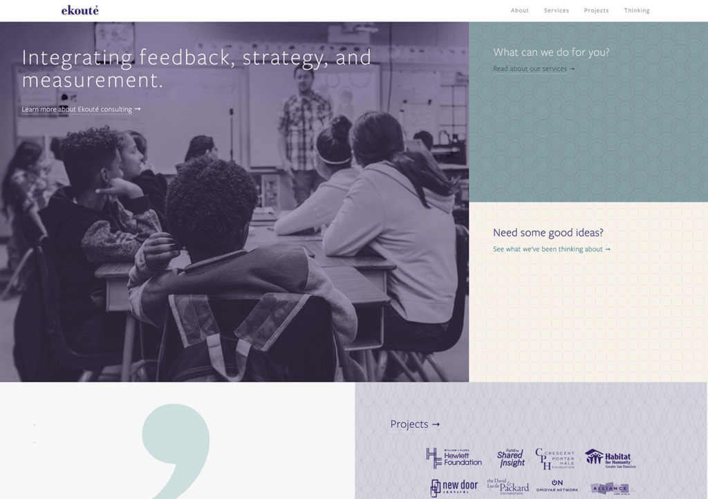
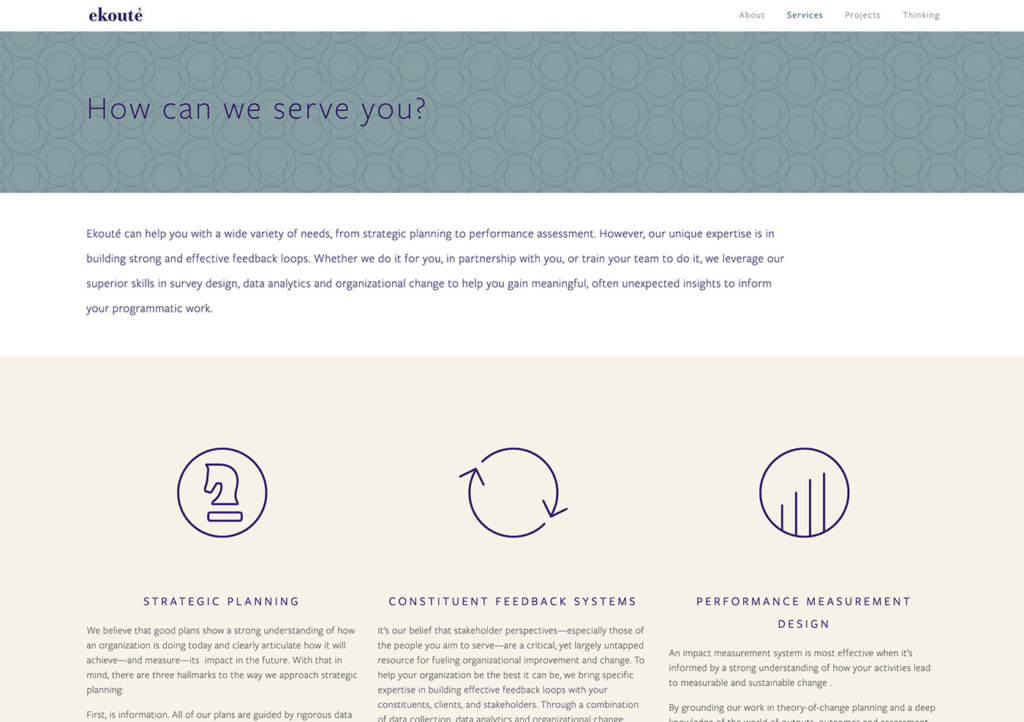
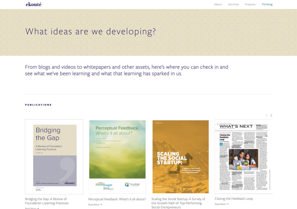
While Dayspring’s web designers often build large websites on WordPress, we leverage Squarespace’s platform for website projects that are smaller in size, limited by budget, and prioritize ease of maintenance. For Ekouté’s website, we went this route, choosing to also add some customized features to fit the client’s needs like a glove. Working off the ideas, motifs, and colors established in the new brand identity, we created a set of geometric patterns to reinforce the brand on every page while beautifully supporting the photography we helped select to tell Ekouté’s story. The result reflects Ekouté’s founder and her team: thoughtful, passionate, and approachable.