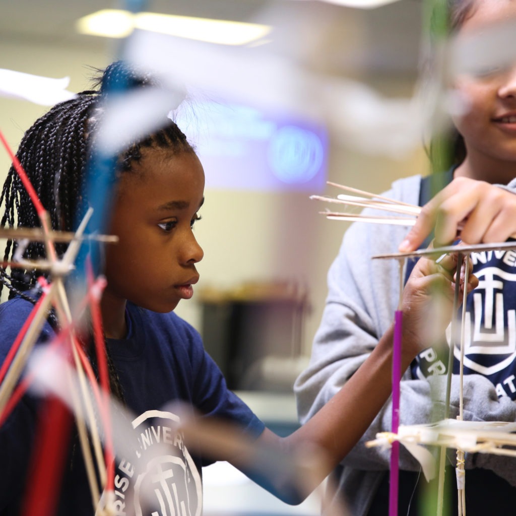
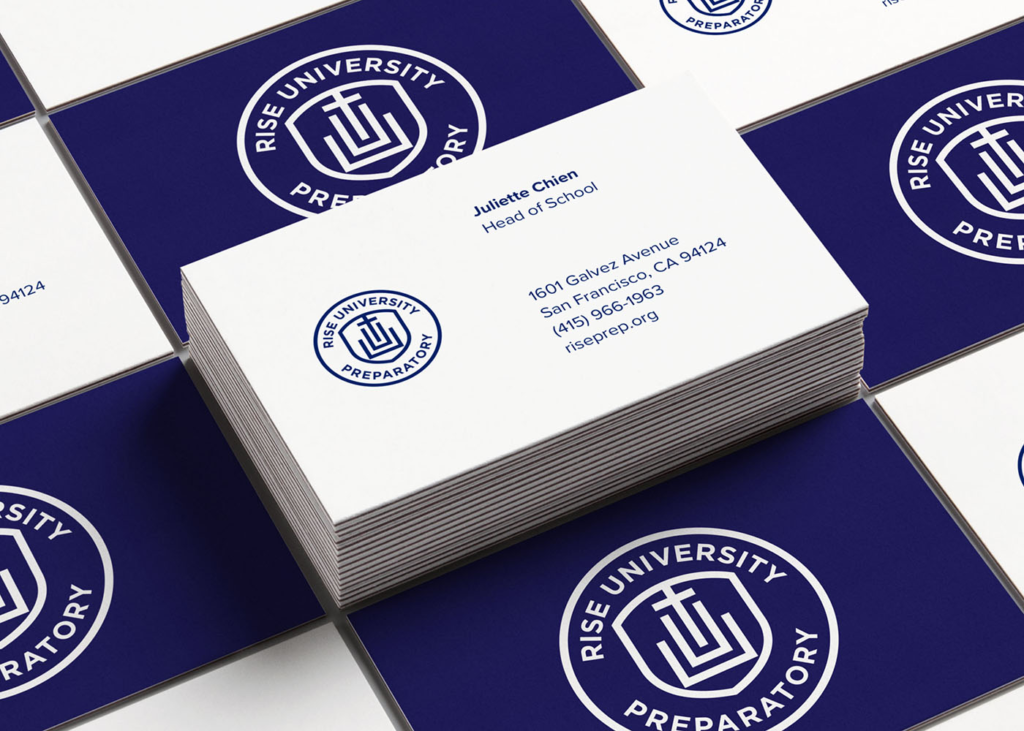
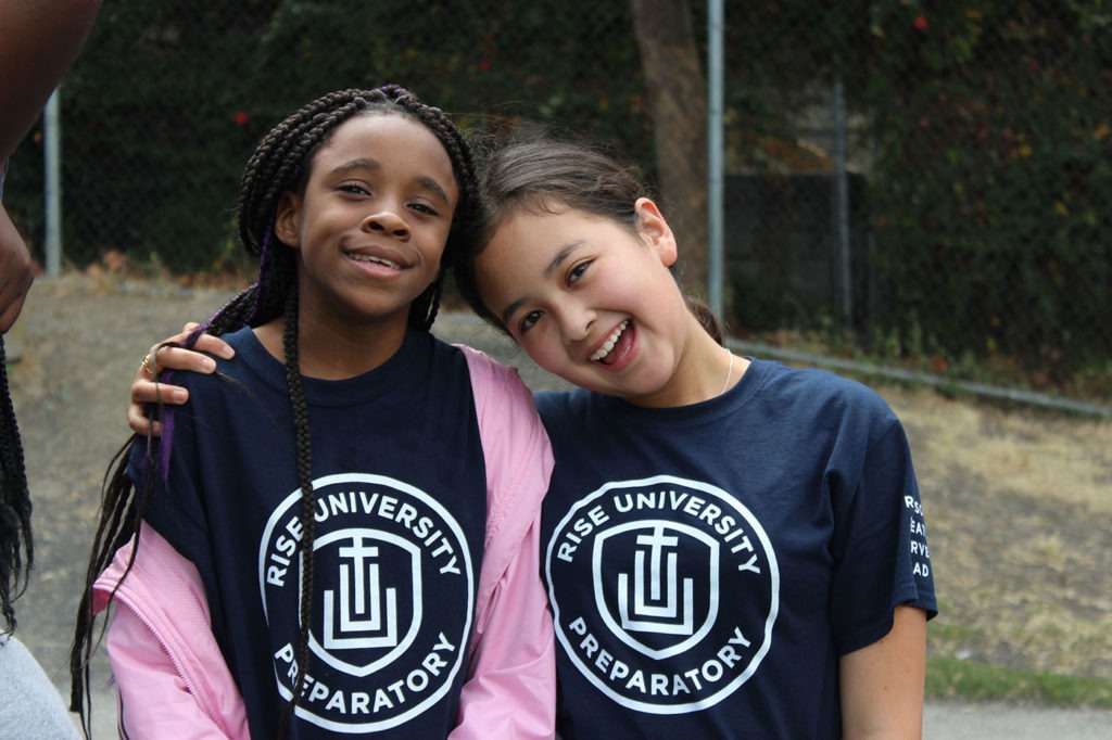
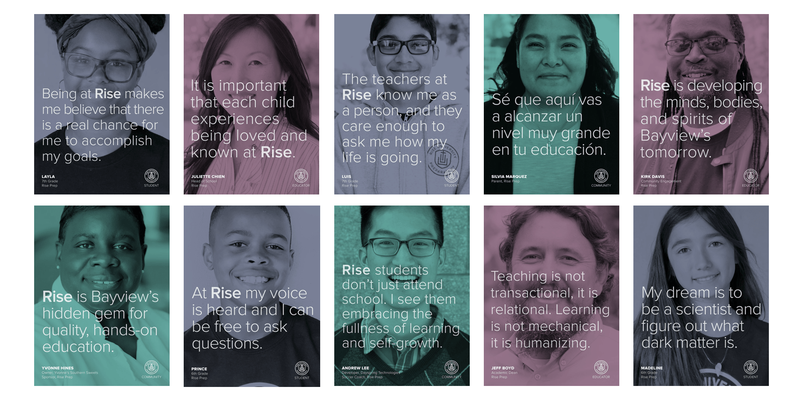
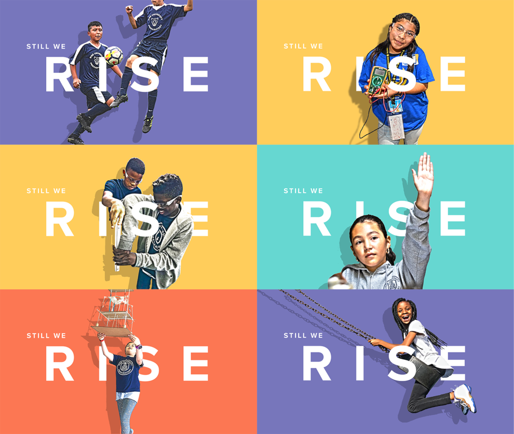
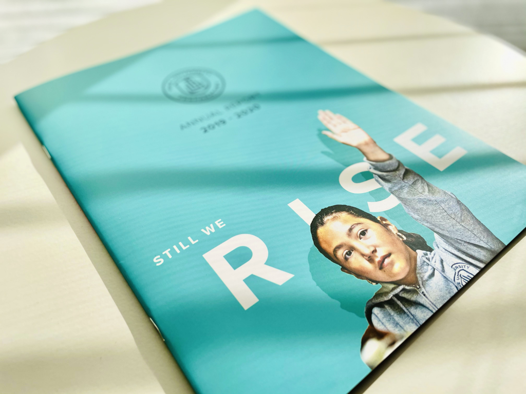
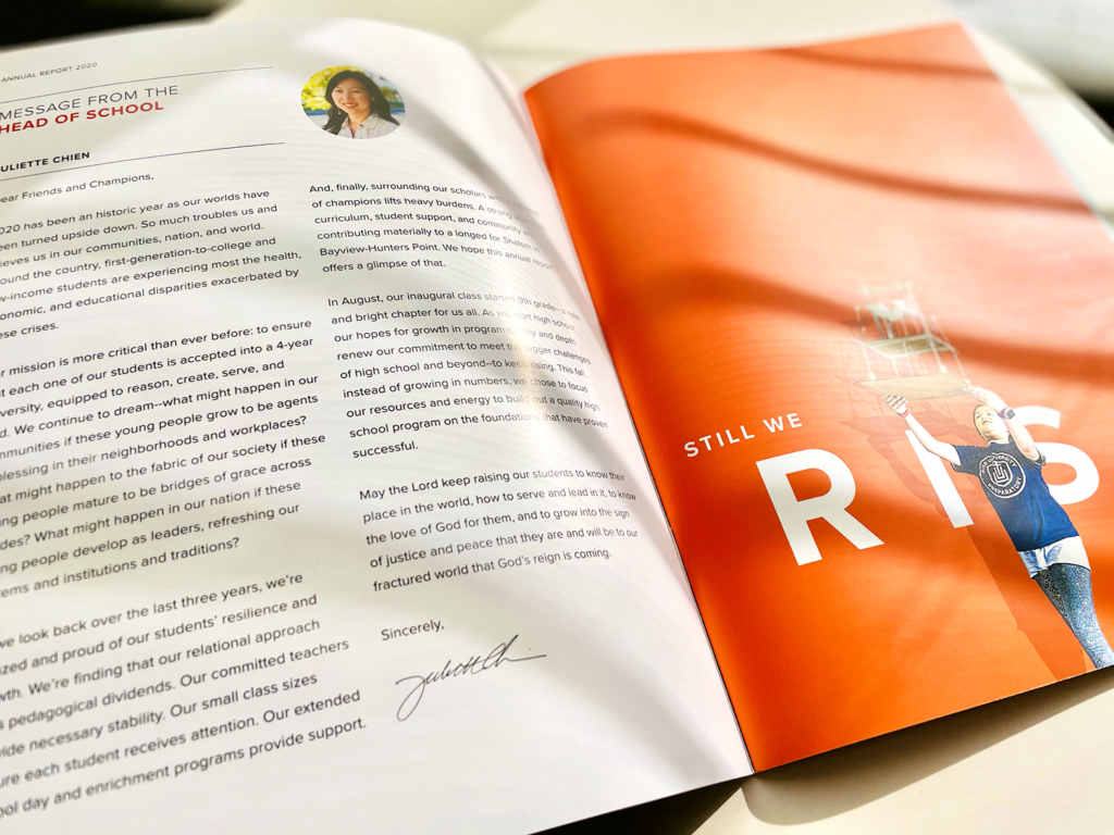
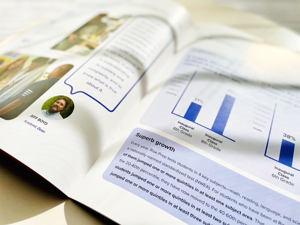
Portfolio

Rise University Preparatory

Rise University Prep had a compelling vision, commitments from passionate educators, and backing from several fundraising efforts. What they needed next was a brand identity that would help win confidence from student families, supporters, and the community.

New brand identity and website design

Rise Prep student with logo design on uniform

The Partnership

Rise University Preparatory is a new independent school that aims to prepare students from Bayview, a historically low-income area in San Francisco, for college and beyond. As neighbors with shared goals and values, Dayspring and Rise Prep have an unusually deep partnership. Our brand design work is just the tip of the iceberg — since Rise’s founding, Dayspring has provided strategy consulting, brand designweb designSalesforce services, and financial support. And in return, Rise Prep has provided us with opportunities to tutor and invest ourselves in the lives of students who have the potential to lift up the neighborhood we all share.

The Challenge

When organizations and businesses come to us for brand design, they typically want a design that makes them stand out. However, for Rise Prep, there was a concern that both prospective students and potential supporters would view them with skepticism. The wrong approach could make them come off as yet another experimental model that was seeking to lift up a struggling neighborhood, but would fade quickly after some initial fanfare. Before designing their website and marketing materials, our challenge was to establish a brand identity that would reflect the school’s firm foundation of faith, passion, and unwavering commitment.

The Project

Service

From the beginning, Rise Prep made it clear that their approach to educating and nurturing their students was centered on an uncompromising attention to the fundamentals. Their belief in this intentional approach, even as they were also breaking the mold by closely partnering with both a tech company and a church, guided our approach to their brand design. Rather than eschew visual artifacts that are usually associated with traditional and established academic institutions, like the school seal, we chose to embrace them, making them modern with a sans-serif typeface and clean, contemporary lines.

The brand color palette centers on a deep, rich blue that feels timeless and steadfast but has a touch of enterprising boldness, a subtle nod to their location in the hub of technology and startups. This sense of duality in the brand identity would eventually extend to all communications material, including the website, which marries the brand’s seal and bold blue with clean layouts and inspirational images.

In addition to the primary brand, Dayspring also created an auxiliary athletics brand based on a mascot selected by Rise Prep students. While the primary brand is the face of Rise Prep to students, their families, the community, and donors, the athletic brand plays out on the court and field. The Rise Prep Panther was designed to appeal to the students and to convey intensity, resolve, and determination without a sense of threatening aggression.

Rise Prep logo design featured on business cards
Rise Prep's branding design on two students' uniforms
Rise Prep's brand mark with panther mascot on a sports cap
Rise Prep's branding for athletic apparel features the panther mascot
showcasing rise prep students for the 2020 Gala fundraising event
cover of the rise prep 2020 annual report
2020 rise prep annual report layout showing message from the head of school
rise prep 2020 annual report pages showing academic growth

Let’s talk

Looking for a brand or web design partner? Get in touch with us to start a conversation.

415.247.9421 Ext. 102